12 QQ Plot - How To Use And Interpret
In this practical we will go through practical applications of quantile quantile plots (QQ plots) and look at interpreting results. We went through the most common way they are used to check for normality. You can of course use them to compare observed data to any distribution. During this exercise we will use as example data randomly generated data and a the mtcars data-set built into R.
12.1 Introduction and Simulation
Let us go through creating a QQ plot from basic principles, this will give you a good understanding of what happens in the background when you use the qqplot functions in R. You are unlikely to do this yourself in the future but it is good to know what is happening and understand the principles you are applying.
We will make a start by generating some random data sampled from a normal distribution \(\operatorname{N}(\mu = 5, \sigma^2 = 4)\).
# Random seed, there is no significance to the number used
set.seed(1214)
# create random number sampled from a normal distribution
x <- rnorm(20, mean = 2, sd = 2)

print(x)
#> [1] 3.0199947 1.7430854 3.8219702 1.2638861 -0.9820494
#> [6] -1.6086784 2.1157220 -0.4646442 -1.2996165 3.7570844
#> [11] 0.8184567 2.1577627 1.6635102 2.6436570 -0.4730233
#> [16] 5.1968979 4.5040566 0.6371819 0.5883411 0.0900340The first step is to sort the data, and then can create quantiles. We can create naïve quantiles based on this data first. This is done by ranking the data and dividing by the length of the data. This is a simple way to create quantiles but it is not centered. We will also create theoretical quantiles based on the standard normal distribution.
#>  [1] 0.05 0.10 0.15 0.20 0.25 0.30 0.35 0.40 0.45 0.50 0.55
#> [12] 0.60 0.65 0.70 0.75 0.80 0.85 0.90 0.95 1.00
When we create theoretical quantiles we want to center them. You can check this yourself try qnorm(0) and qnorm(1). Instead we adjust the ranks by \(1/2\) to get a centered bins. There is an inbuilt function in R that also performs this adjustment, ppoints. Remember to check how it works using ?ppoints
# Emperical quantiles
eq <- (rank(x_sort) - 0.5) / length(x_sort)

# Emperical quantiles using ppoints
eq_p <- ppoints(length(x_sort))

# Check if the two ways produce an identical vector
print(identical(eq, eq_p))
#> [1] TRUE#> [1] 0.025 0.075 0.125 0.175 0.225 0.275 0.325 0.375 0.425
#> [10] 0.475 0.525 0.575 0.625 0.675 0.725 0.775 0.825 0.875
#> [19] 0.925 0.975You can see that the first quantile 0.05 becomes 0.025. We will use the sample mean and sample standard deviation. We also want to project our data on the standard normal distribution as that is how a QQ plot is generated. It is just a simple transformation and we can plot the two values to convince ourselves that is the case.
# Theoretical quantiles
tq <- qnorm(eq, mean(x_sort), sd(x_sort))

# Quantiles for Standard noraml
tq_sn <- qnorm(eq, 0, 1)

# Plot the two values
# You will see that it is simple transformation. All values are on straight line
plot(tq, tq_sn)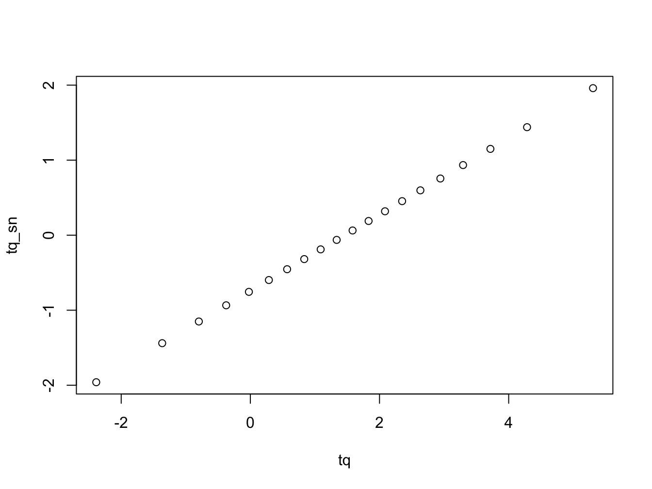
#>  [1] -2.38629750 -1.36506828 -0.79761487 -0.37423528
#>  [5] -0.02264695  0.28671456  0.56927742  0.83442492
#>  [9]  1.08858000  1.33663381  1.58272910  1.83078291
#> [13]  2.08493799  2.35008548  2.63264834  2.94200986
#> [17]  3.29359818  3.71697778  4.28443118  5.30566040
The next thing we need is to create is the reference line to assess if the empirical quantiles correspond to the theoretical ones from the distribution we are comparing to. There are two lines we could consider, it is either the naïve line\(y = mean + s \times x\), where \(s\) is the sample standard deviation and the mean is the sample mean. The other option is a robust line which works better especially if there is deviation from the normal in the sample, here we replace the mean with the median and the standard deviation with the interquartile range. a QQ Let us put everything together and create a plot with both the naïve and robust lines.
# library for plotting
library(ggplot2)

# create a data.frame with the vectors we have already created
qq_df <-
  data.frame(
    x = x_sort,
    eq = eq,
    tq = tq_sn)

# Add the naïve line
qq_df$naive <- mean(x_sort) + sd(x_sort) * tq_sn

# Add the robust line into the data.frame
qq_df$qq_line <- median(x_sort) + IQR(x_sort) * tq_sn

# When using ggplot you start with the basic framework declaring the data
# We declare the data and aesthetics of the plot that are shared
# We end with a + to indicated there is more to come
ggplot(data = qq_df, aes(x = tq)) +
  # We create points for the observed data with size =3
  geom_point(aes(y = x_sort), size = 3) +
  # We create the naïve line in blue
  geom_line(aes(y = naive), col = "blue", size = 2) +
  # We create the robust line in red
  geom_line(aes(y = qq_line), col = "red", size = 2) +
  # Change the plot theme to something easier to see
  theme_bw() +
  labs(
    x = "Theoretical Quantiles",
    y = "Sample Quantiles"
  )
#> Warning: Using `size` aesthetic for lines was deprecated in
#> ggplot2 3.4.0.
#> ℹ Please use `linewidth` instead.
#> This warning is displayed once every 8 hours.
#> Call `lifecycle::last_lifecycle_warnings()` to see where
#> this warning was generated.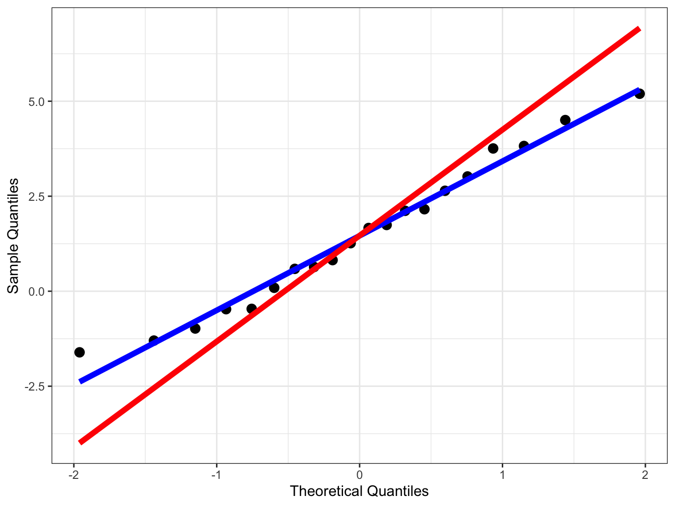
You can see that there is a small difference between the two lines but it can be larger depending on the data.
12.2 Plotting QQ Plots in R
Everything above was just to gain an understanding of what goes into a QQ plot. Of course you would not go through this whole process every time you want to create such a plot. Instead you would use inbuilt functions in R.
Let’s first recreate the plots based on the above data to check it’s working and ensure we have performed the correct steps. We will use both base R plots and ggplot
First we use ggplot and you will note that instead of providing the x or y aesthetics we provide the the sample aesthetics. As usual to learn more about this use ?stat_qq and ?stat_qq_line to learn more about these.
# ggplot providing the data.frame variable and the sample
ggplot(data = qq_df, aes(sample = x_sort)) +
  # creating the points in the sample
  stat_qq(size = 3) +
  # Create the line for comparison
  stat_qq_line(size = 2, col = "blue") +
  # Choosing a simpler theme
  theme_bw()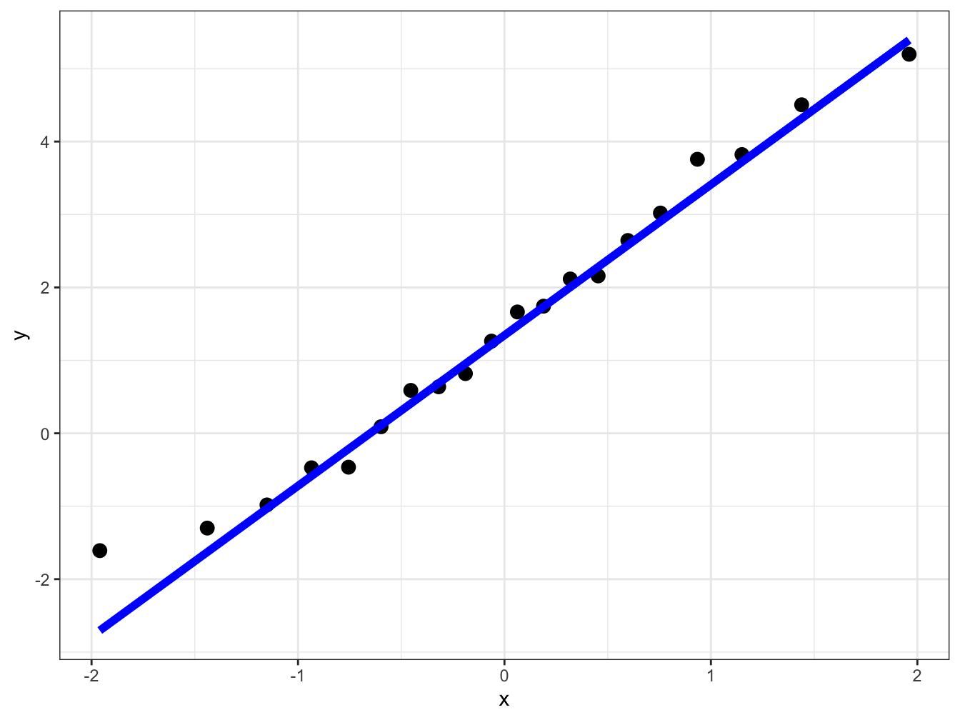
You can also use base R to create these plots using the functions qqnorm and qqline. Check the help functions for these before making use of them.
# Create a plot of sample quantiles and theoretical quantiles
qqnorm(x_sort, frame = FALSE)
# Create the reference line for comparison in blue linewidth = 2
qqline(x_sort, col = "blue", lwd = 2)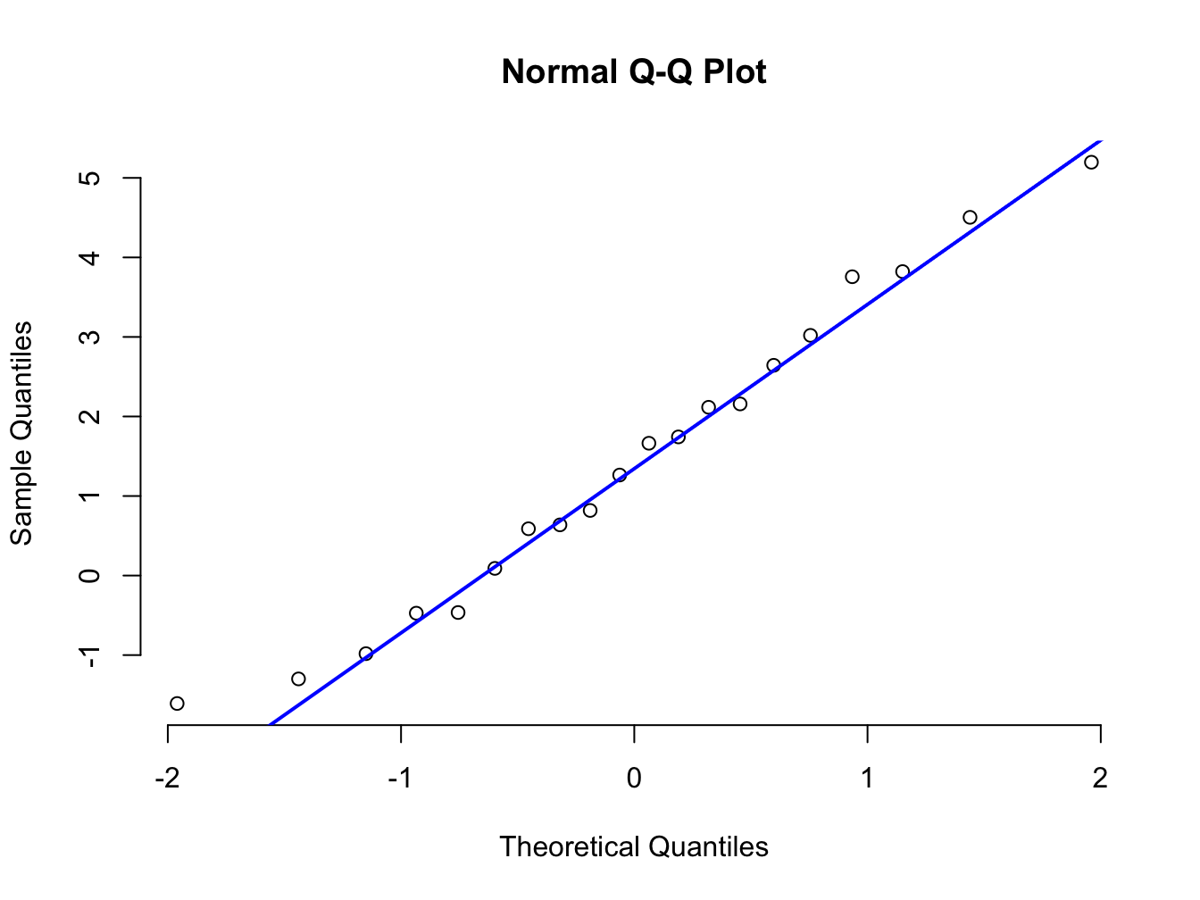
We can see that all plots we have created above yield the same results. Both work but ggplot has more versatility. Let us look at that using the mtcars data.
This dataset contains a variety of information about cars. We will specifically make use of the miles per gallon (mpg) and the number of cylinders (cyl). One data structure we will make use of here is factors. (See here for brief description and some exercies on factors.)
# convert the cyl varibale in the data into factors
mtcars$cyl <- as.factor(mtcars$cyl)

# Look at the top 6 rows of the data.frame
head(mtcars)
#> mpg cyl disp hp drat wt qsec vs am
#> Mazda RX4 21.0 6 160 110 3.90 2.620 16.46 0 1
#> Mazda RX4 Wag 21.0 6 160 110 3.90 2.875 17.02 0 1
#> Datsun 710 22.8 4 108 93 3.85 2.320 18.61 1 1
#> Hornet 4 Drive 21.4 6 258 110 3.08 3.215 19.44 1 0
#> Hornet Sportabout 18.7 8 360 175 3.15 3.440 17.02 0 0
#> Valiant 18.1 6 225 105 2.76 3.460 20.22 1 0
#> gear carb
#> Mazda RX4 4 4
#> Mazda RX4 Wag 4 4
#> Datsun 710 4 1
#> Hornet 4 Drive 3 1
#> Hornet Sportabout 3 2
#> Valiant 3 1We can now use this slightly changed data.frame to create QQ plots in one go subsetting for the number of cylinders cars have.
# We use as the data the slightly modified mtcars data.frame
# As asthetics we mpg as the sample and we want to colour code for cyclinders
ggplot(data = mtcars, aes(sample = mpg, color = cyl)) +
  # We create the points first
  stat_qq(size = 2) +
  # We now add the reference lines
  stat_qq_line(size = 1.5) +
  # We choose a theme that is easier to read
  theme_bw()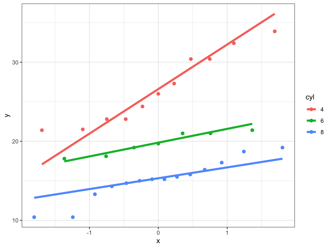
You can see how useful this approach can be be and managed to create a lot of information in a few lines of code.
12.3 Interpreting QQ Plots
The main reason we use QQ plots is to assess if our data can be from a specific distribution. Usually we will perform this test to check for normality. This can be important if we perform a statistical test that makes the normality assumption. Since it is only a visual test it is subjective.
In QQ plot we are putting our data in quantiles and answering the questions: how similar are these sample quantiles to the theoretical values from a probability distribution. We put each data point we observe into its own quantile and compare them to a theoretical probability distribution.
Obviously, because we are looking at subjective visual comparison it is important to understand what these comparisons mean. To do that we will first create a few functions to make it easier to go from random sample to plot.
# function to plot histogram and distribution for comparison
hist_comp  <- function(x, n_breaks = 30, title, xs, norm_dens) {
  hist(x, breaks = n_breaks, xlab = "Sample Value", ylab = "",
       freq = FALSE, main = title, ylim = c(0, 0.45))
  lines(xs, norm_dens, type = "l", col = "red", lwd = 2)

}

# function to create QQ scatter plot and reference line
qq_comp <- function(gaussian_rv) {
  qqnorm(gaussian_rv)
  qqline(gaussian_rv, col = "blue", lwd = 1.5)
}
12.4 Standard Normal
Now we can start comparing, we will start with the simplest comparison. Here we will sample from a normal distribution with \(\operatorname{N}(\mu = 0, \sigma^2 = 1)\).
# Create two plots next to each other one row and two columns
par(mfrow = c(1, 2))

# Sample data
n <- 10000
set.seed(1234324) # choosing reproducible seed for random number
data_sample <- rnorm(n)

# normal density
# xs are x-values for the distribution
xs <- seq(-5, 5, 0.01)
norm_dens <- dnorm(xs)

hist_comp(data_sample, title = "Gaussian Distribution",
         xs = xs, norm_dens = norm_dens)

qq_comp(data_sample)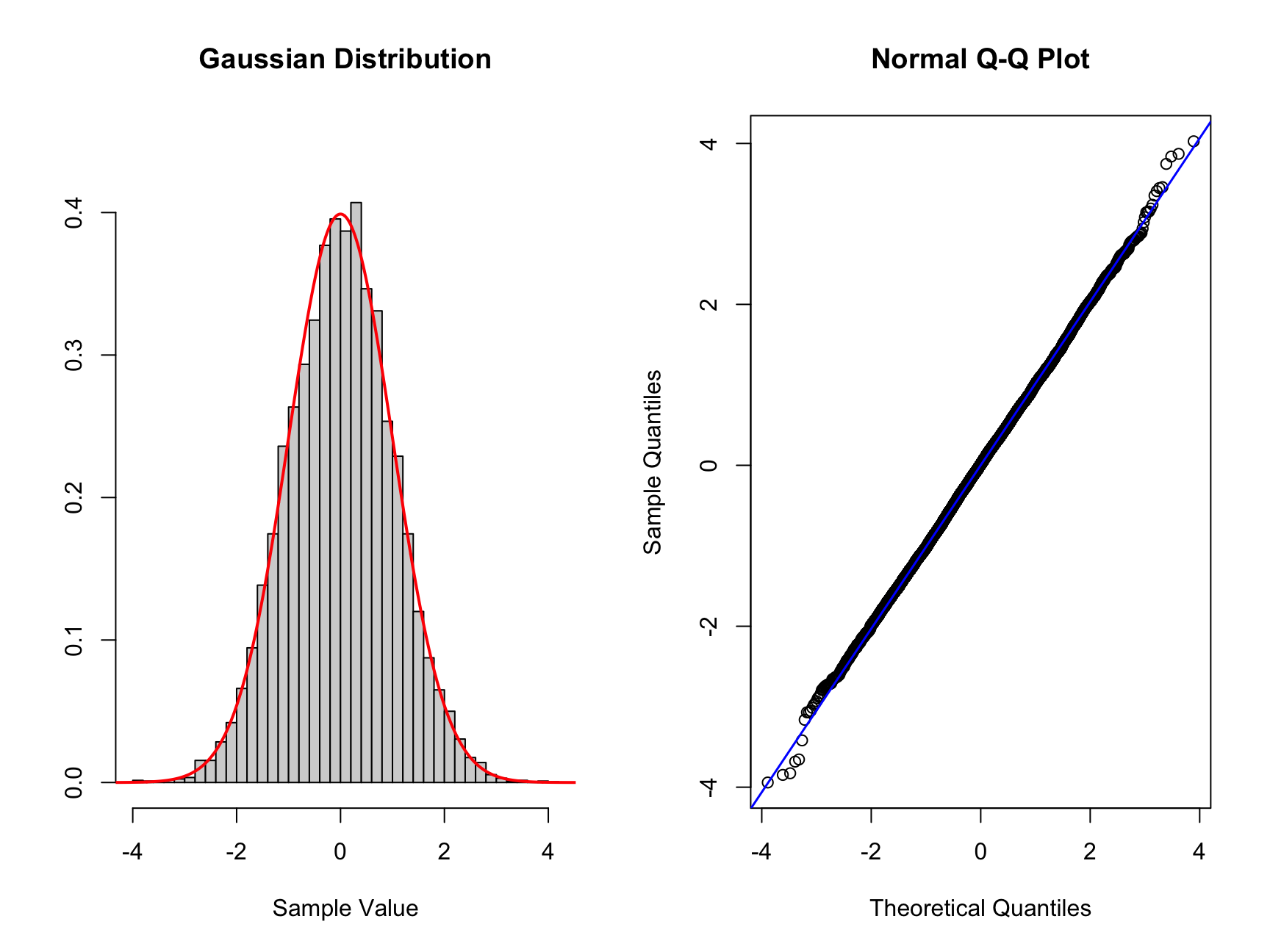
Here we can see on the left the theoretical Gaussian distribution as the read curve. The histogram shows the sample with n = 10000. The same data is represented on the right which is a QQ plot. The normal distribution is along the diagonal blue line. We can see that this data lies mostly along the diagonal so matches the standard normal. There is some minor deviation on the edges of the distribution. Here there are minor deviation on the tails but only a handful of points out of the large sample.
12.5 Skewed data
Now we will look at data that is skewed in either directions, which we can see on the histogram and what that looks like on the QQ plot. We will make use of filtering the vector of data using the square brackets. If we have a vector vec_a we can subset (or filter) all values smaller than zero by using vec_b <- vec_a[vec_a < 0]. This new vector vec_b contains all entires in vec_a that are smaller than 0.
# Skewed left more samples to the left of standard normal
# To create this data we will add more samples to the left of the mean
# artificially using the same data as above
set.seed(1234234) #set a random seed
# we create a vector which contains the new data
new_skew_left <- data_sample[data_sample < 0] * 2
nor_skew_left <- c(new_skew_left, data_sample)

# Create new plots
par(mfrow = c(1, 2))
hist_comp(nor_skew_left, title = "Skewed Left", xs = xs,
          norm_dens = norm_dens)
qq_comp(nor_skew_left)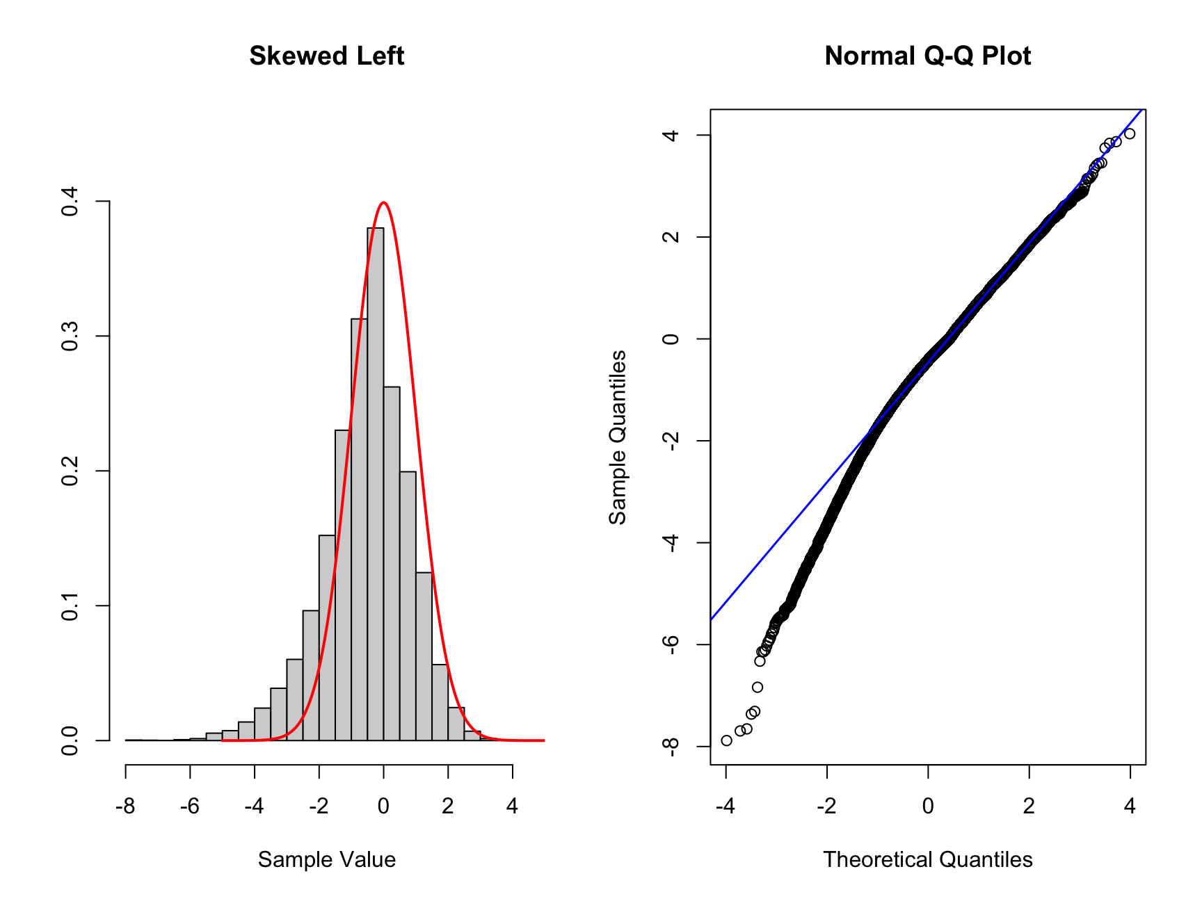
If the data is left skewed as in this case, you can see that the histogram is shifted to the left compared to the standard normal distribution. You can see a proportion of the data on the left tail of the distribution. Now looking at the corresponding QQ plot we can see the first two quantiles are blow the theoretical (diagonal) line. The points above 0 are close to the diagonal but below 0 the points deviate from the diagonal. If you see such a QQ plot, the interpretation is that the data is left skewed.
Q. Now try to create data skewed to the right and interpret the plots you create.
Only expand once you have made an attempt!
# Skewed right more samples to the right of standard normal
# To create this data we will add more samples to the right of the mean
# artificially using the same data as above
set.seed(1234234) #set a random seed
# we create a vector which contains the new data
new_skew_right <- data_sample[data_sample > 0] * 2
nor_skew_right <- c(new_skew_right, data_sample)

#Create new plots
par(mfrow = c(1, 2))
hist_comp(nor_skew_right, title = "Skewed Right", xs = xs,
          norm_dens = norm_dens)
qq_comp(nor_skew_right)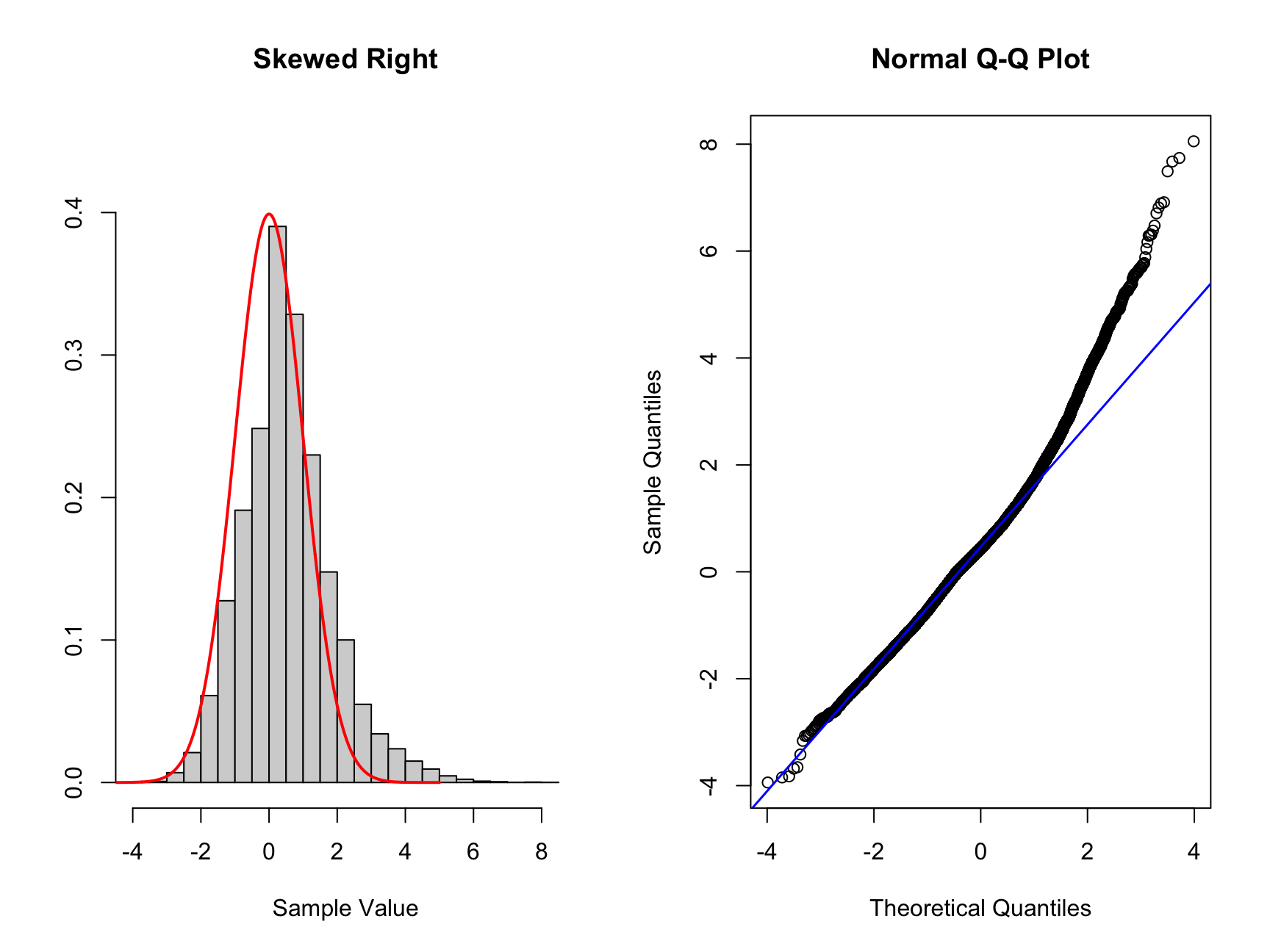
12.6 Symmetric Tails
We can also have tails which are symmetric on both sides. We distinguish between fat tailed and thin tailed distributions. We will again create such data and look at how we can identify them in a QQ plot. We wills tart with at fat tailed example.
# To create fat tailed data
nor_fat <- c(data_sample * 3, data_sample)

# Create plot
par(mfrow = c(1, 2))
hist_comp(nor_fat, title = "Fat Tails", xs = xs, norm_dens = norm_dens)
qq_comp(nor_fat)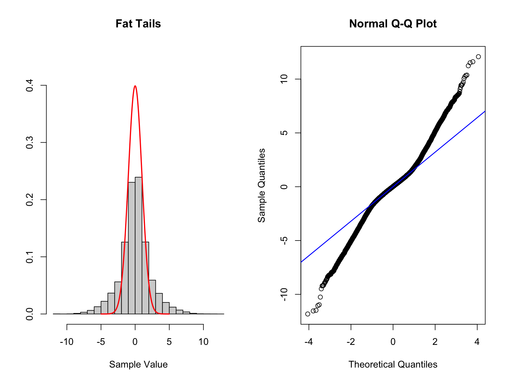
Here we can see the histogram there is more data located both to the right and left of the standard normal distribution drawn as a red line. When we look at the QQ plot we see that the first quantiles are smaller than the corresponding theoretical values. For larger quantiles the values are larger than the theoretical values.
We can now look at thin tailed, the easiest way to simulate this is by using a normal distribution with variance smaller than 1.
# Create thin tailed data
set.seed(1112) # set a random seed
# we simulate new data with n as before but different variance
norm_thin <- rnorm(n, sd = 0.5)

# Create plots
par(mfrow = c(1, 2))
hist_comp(norm_thin, title = "Skewed Right", xs = xs,
          norm_dens = norm_dens)
qq_comp(norm_thin)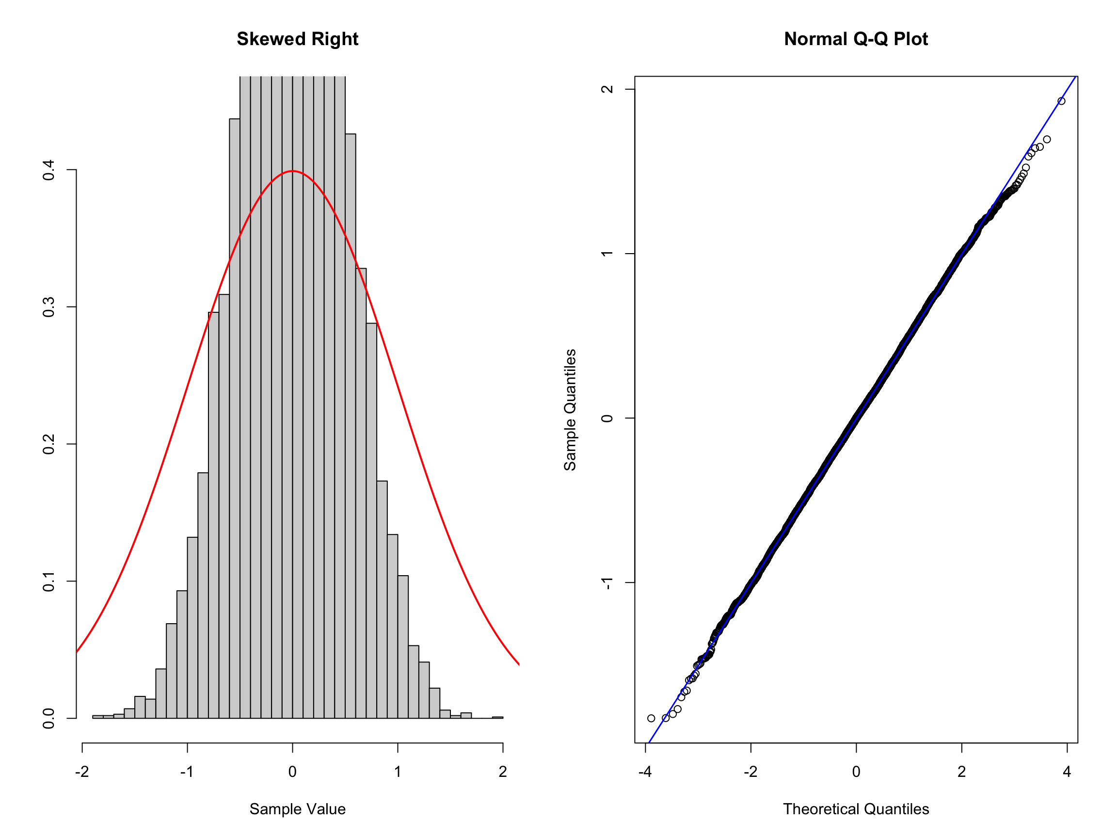
Here we can see that the histogram of the data indicating a distribution narrower than the standard normal distribution. Here it is a little tricker to see in the QQ plot but you should notice that the initial quartiles have values higher than the diagonal and the last quantiles have values smaller than the diagonal. This is the opposite behavior compared to the fat tailed distribution.